Exploring Park Perception in Oakland
Background
Parks are one of the few "free-to-be" places in our cities and towns. They are integral to health and well-being by integral to health and well-being by providing space for physical activity and been shown to help reduce stress. They've been connected to lower cawrdiovascular disease risk factors, Type 2 diabetes prevalence, and heat-related mortality risk.
They also provide a space for community, whether folks are there to hang out wiht friends and family or to be alone but amongst neighbors. During the COVID-19 pandemic, people became much more aware of this important role of parks.
Environmental "hard" data metrics of parks like vegetation index and tree canopy cover are often used in characterizing parks. Park access is also a prominent data point in recent years with statewide initiatives like CA Parks for All. However, this tool uses Euclidean distance from parks alone to characterize access, without considering various travel modes. These gaps led us to explore more nuance in the data regarding park quality utilizing skills learned in this class.
Research Questions
We created a three-pronged approach for our research questions and sub-questions to guide this exploration: park access, park amenities and perception, and park disparities.
- Park access
- Which parks have adequate transit access (defined as within a walkable distnace of 1/4 mile)?
-
Park amenities and perception
- What amenities are in Oakland's parks?
- How are Oakland's parks perceived (via park ratings)?
- Are there certain features that are related to higher rating?
- What kinds are people doing in parks?
-
Park Disparities
- How does adequate transit access vary between parks in priority and non-priority neighborhoods?
- Are there spatial differences in amenity counts and types?
Data
When one wants to explore a new park, searching online can be a helpful tool for this. While apps like Strava and AllTrails have a plethora of data on parks with trails, their users tend to be more fitness-minded and do not necessarily capture other uses of parks. Considering this, OpenStreetmap, Google Reviews, and Yelp were selected as data sources. City of Oakland’s parks data was also utilized for cross-checking but ultimately not incorporated due to quality issues. We did utilize City of Oakland’s Priority Communities data at the census tract-level for the third prong. The table below, we listed the data we used for our analysis as well as limitation we experienced for each source.
| Source |
Data Used |
Limitation |
| OpenStreetMap |
Park names and amenities data for all Oakland parks, road network, and bus stop locations |
User-defined so defintion of parks varied and amenities were only included if someone contributed. |
| Yelp |
Reviews and ratings of Oakland parks through Yelp API |
Smallest dataset. Only 12 parks in Oakland have Yelp reviews. |
| Google Maps |
Average ratings and number of reviews of each Oakland park |
Could not get Google's API so limited to only the ratings. But had many more parks than 12 (119 to be exact!) |
| City of Oakland |
Map of parks dataset - Official Park Names |
Dataset had typos and inconsistencies. This data source was not used in the final analysis, but did aid in some cross-checking. |
Methodology
We took the following steps to clean and analyze our data.
Data Collection and Cleaning
OpenStreetMap Data
- We first pulled all the features listed as parks in Oakland, CA
- We pulled all the features listed as amenities in Oakland, CA
- The amenities were then spatially join with the parks layer. Amenities that were not located within a park were dropped
- We cleaned any errors from the spatial join and dropped any outlier amenities
Yelp
- Using Yelp's API, we found all the parks in Oakland.
- We then pulled all the ratings and reviews, using a for-loop
- We kept only the Oakland parks, filtered out the filler words in the reviews and created a thematic word lists and created a thematic word lists to understand type of activities
Google Maps
Since we were not able to get Google API access, we manually pulled the average rating and number of reviews for Oakland parks in Google Maps
Data Analysis
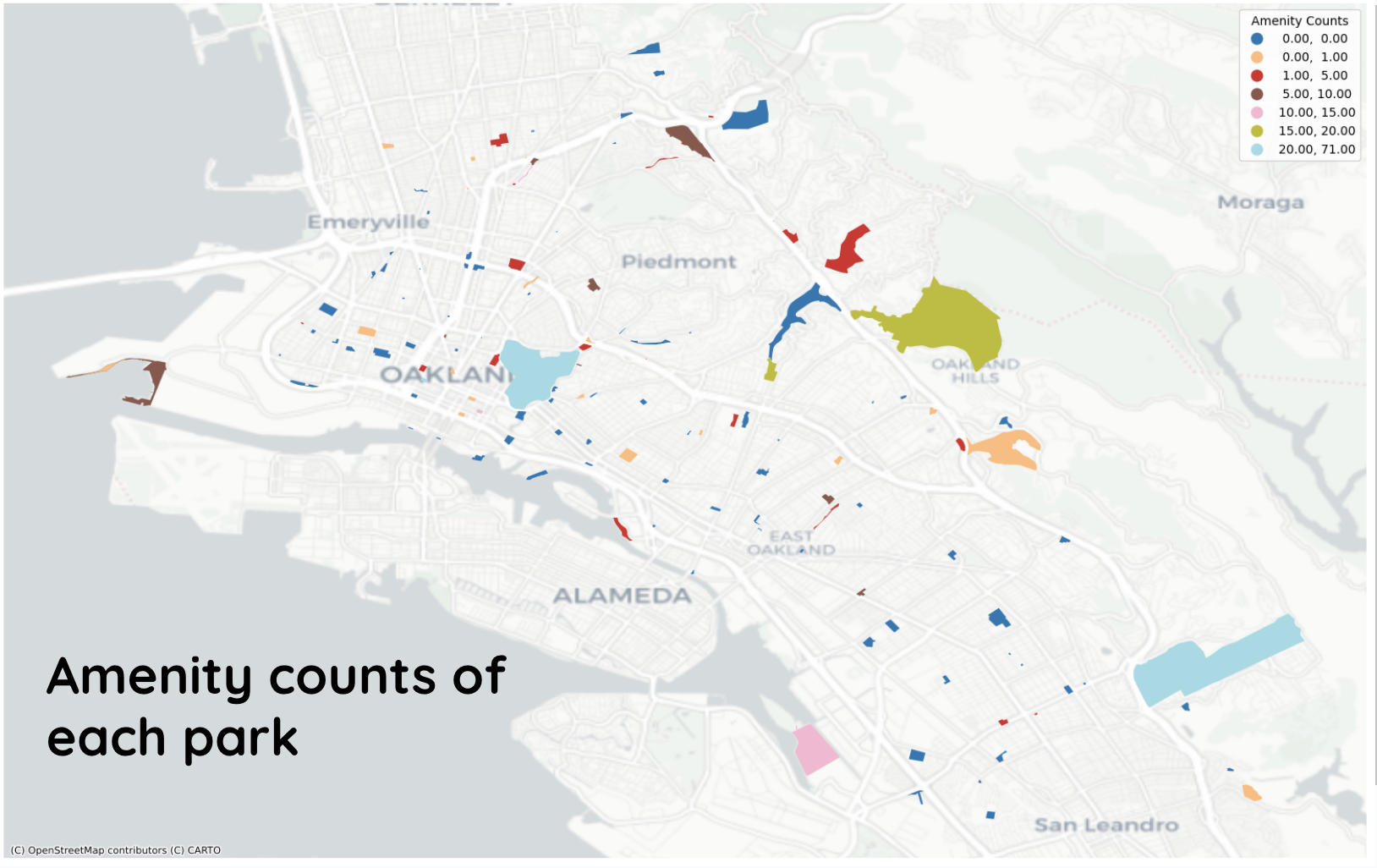
With our cleaned data, we then started to analyze different aspects of parks. We first mapped the parks with their respective amenities cout and plotted a histogram of parks and number of amenities.
We also analyzed bus access by plotting all bus stops against the study park locations, creating an 800-meter or 1/2 mile buffer around each park and summed the number of bus stops and bus routes within the 800 meters radius
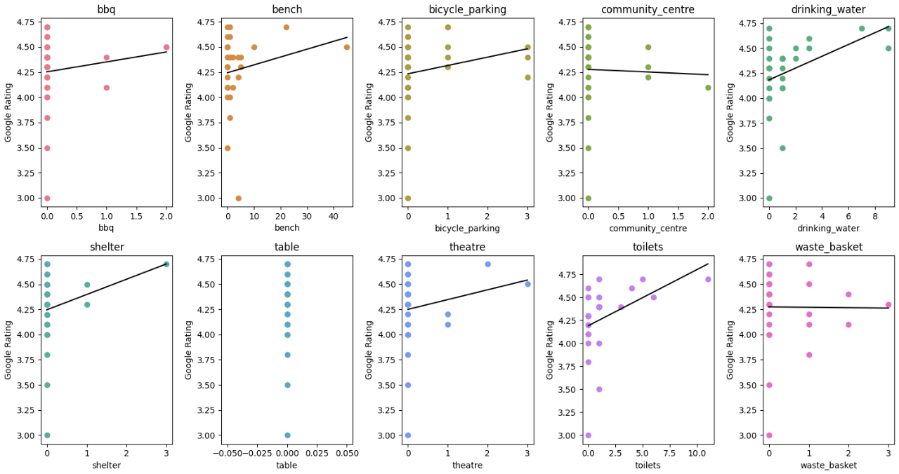
Then, we looked at the Yelp reviews and looked at each of the parks with the thematic words. Finally, we conducted a linear regression with the 10 amenities and Google Maps park ratings.
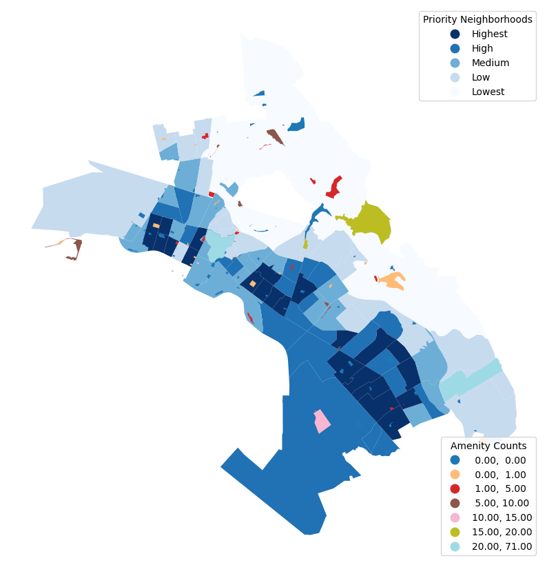
Additionally, we overlayed the parks with the priority neighborhoods and analyzed the relationship between priority neighborhoods, parks amenities, and park ratings
Key Findings
Park Access
Park Amenities and Perception
Park Amenities
From our analysis, after removing non-free amenities and outliers, we found 10 main park amenities. This includes the following amenities:
- BBQ grill
- Bench
- Drinking fountain
- Toilet
- Bike Parking
- Trash bin
- Community center
Picnic table
- Shelter
- Theater (like outdoor amphitheater)
The map below shows the amenity counts of each park in Oakland. Majority of the parks in Oakland do not have any listed amenities.
Parks Perceptions
In addition to determining the main amenities, we also looked at the relationship between park, amenities, and reviews.
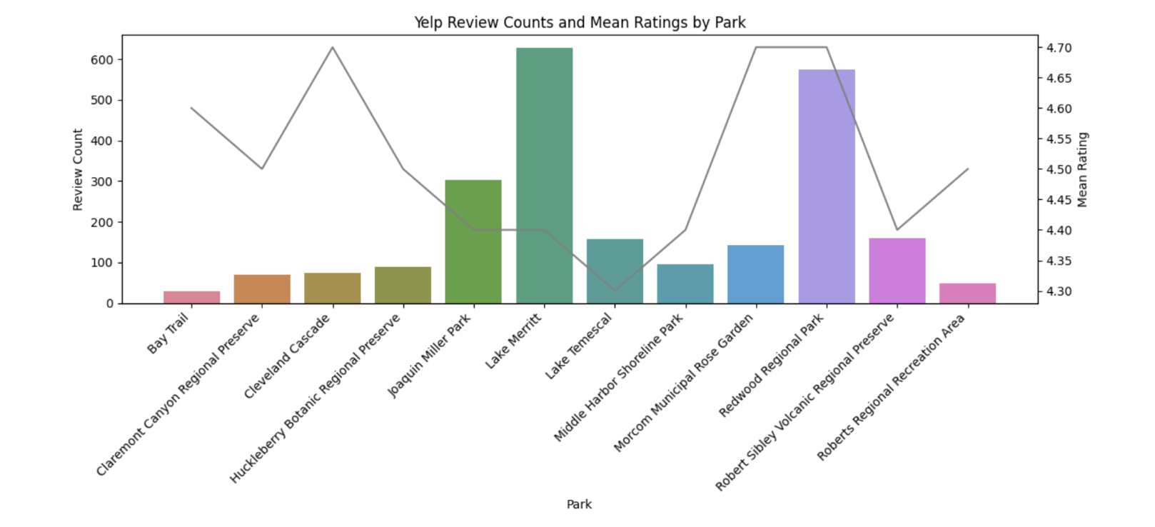
Although we only had a select number of reviews from Yelp, we wanted to see the average ratings from Yelp for each of the parks. Lake Merritt has one of the highest number reviews, but one of the lower average ratings. However, overall, all the parks reviewed in Yelp had an average rating greater than 4.30.
We then looked at the relationship between Google reviews and the ten amenities using linear regression. Each of the amenity had a relatively low R2; however, drinking water and toilets have a slightly higher R2at 0.167 and 0.165 respectfully. When all the amenities were included in one collective model, R2 was 0.258. Overall, we found the more amenities a park has, the higher the rating. Specific amenities such as drinking water and toilets have a larger impact than other amenities. However, amenities like community centers and waste baskets showed a negative impact. This may have occurred due to the relatively small dataset
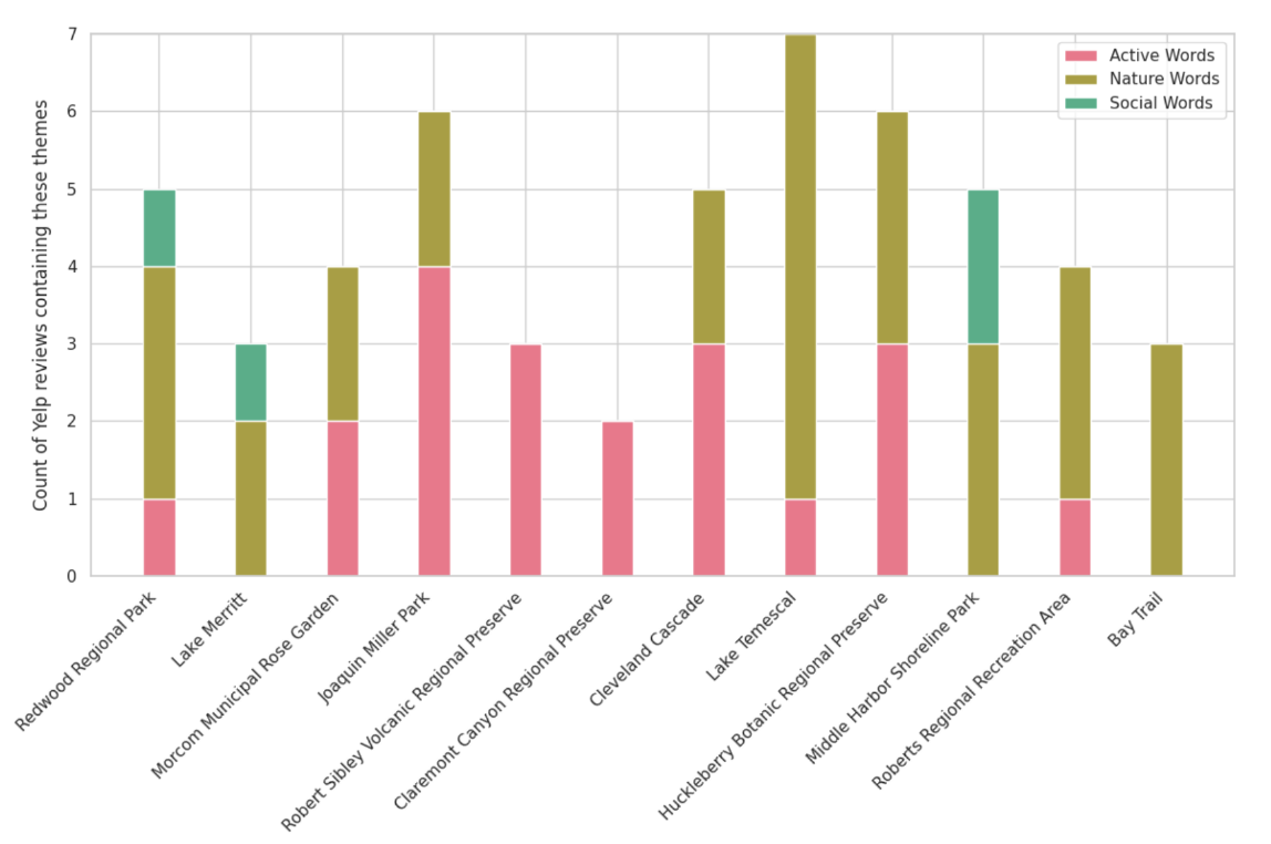
Finally, we created lists of thematic activites (active, nature, and social words), and using the Yelp reviews, we counted the reviews containing those words. The figure below shows the parks and the type of activites occurring at those areas. Lake Temescal, for example, saw more nature words and one count of active words while Redwood Regional Park saw a more healthy mix of activities
Park Disparities
We were also curious about the spatial disparities between parks and their amenities. So we mapped parks and their respective amenity count to Oakland's priority neighborhoods. From our observations, we saw that parks with more amenities were typically located in low and lowest priority neighborhood.
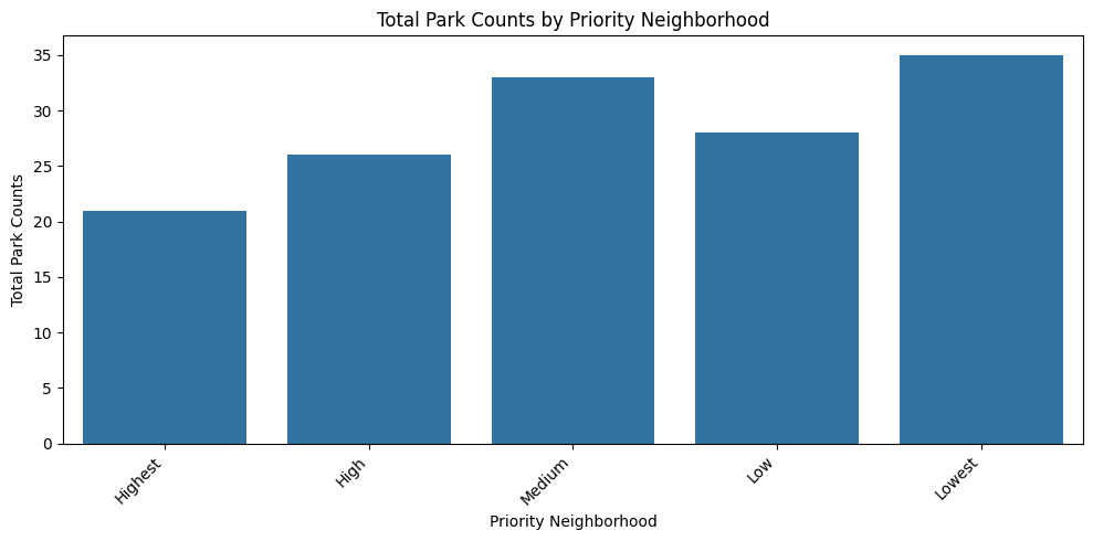
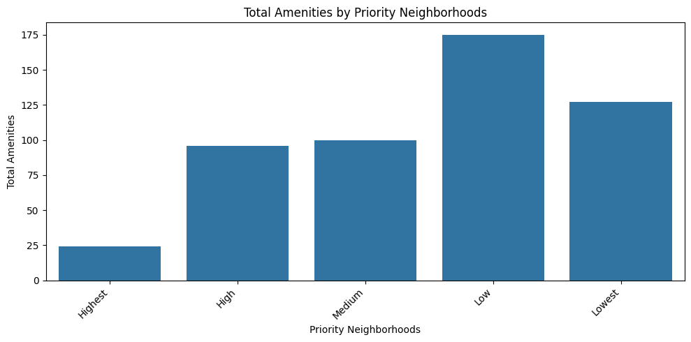
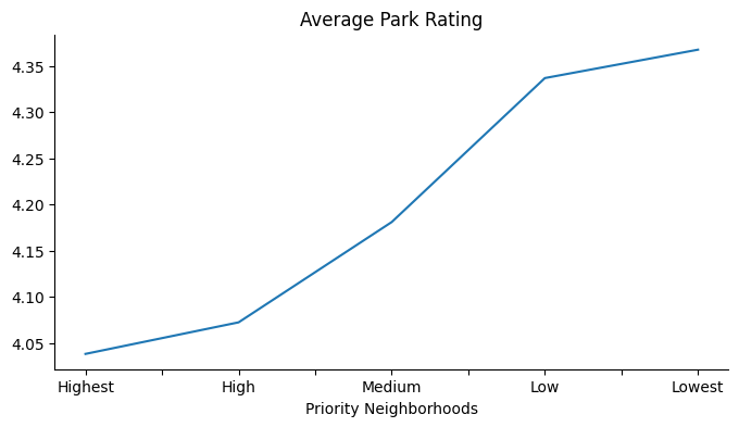
We then proceeded to look at the park counts, total amenities, and average park rating by the priority neighborhoods. Lowest priority neigborhood had the most amount parks and highest average rating while highest priority neighborhoods had the least amount of parks and the lowest average rating. The parks in the highest priority neighborhoods also had the least amount of amenities.